


Color is one of the most powerful tools in interior design. Beyond aesthetics, it influences mood, perception, and even behavior. Understanding the psychology of color allows homeowners and designers to create spaces that not only look beautiful but also feel right.
1. Warm vs. cool tones
Warm colors like terracotta, mustard, and coral bring energy and coziness. They’re perfect for living rooms or dining areas where social interaction thrives. Cool shades—blues, greens, grays—invite calm and clarity, ideal for bedrooms and bathrooms.
2. The emotional role of neutrals
Neutrals aren’t boring—they’re the canvas of design. Cream, beige, and soft gray allow statement pieces like sculptural floor lamps or textured chairs to shine. They also make interiors timeless, balancing bold accents.
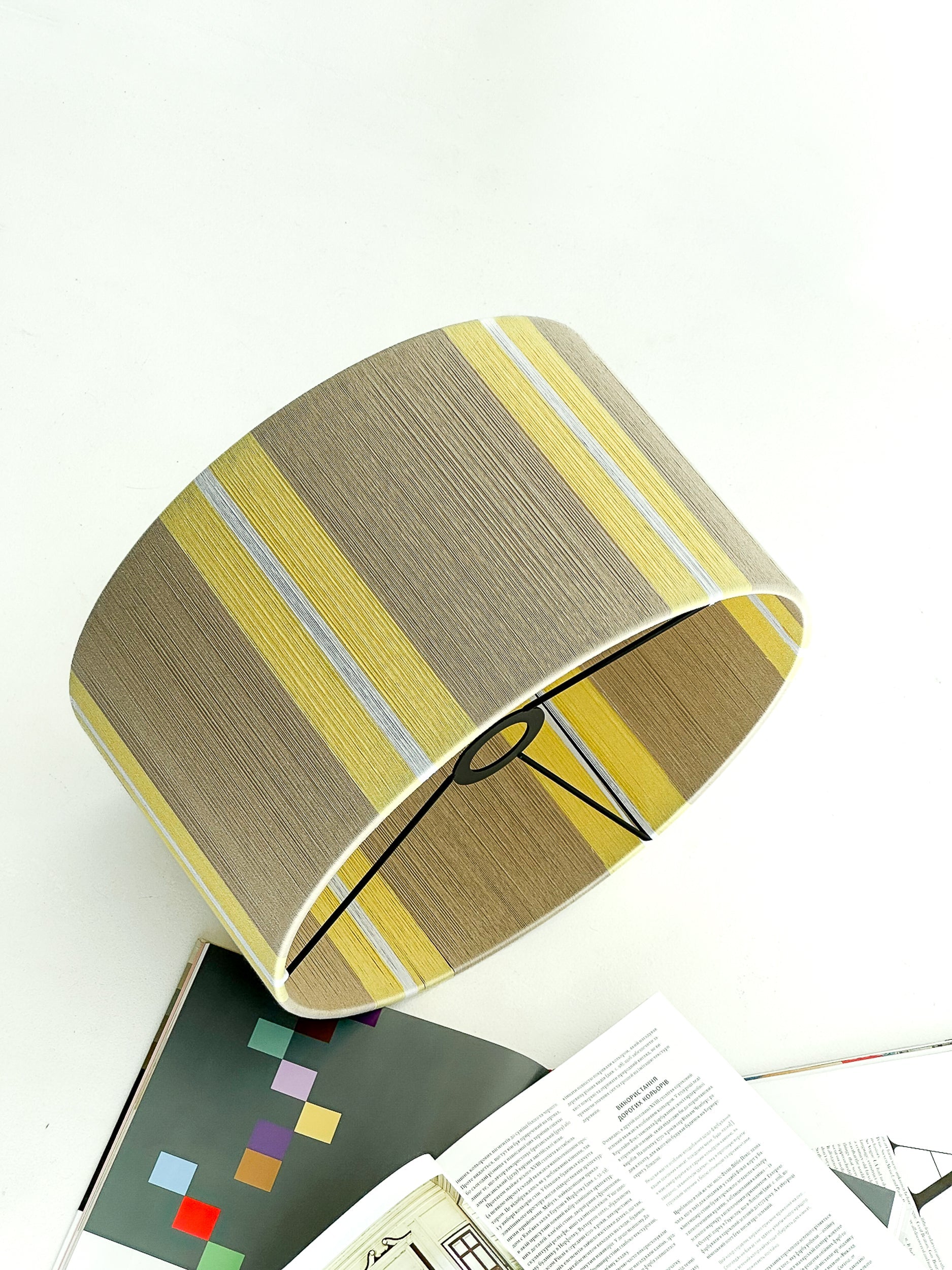
3. Accent colors as mood changers
A pop of vibrant yellow can inject optimism, while deep navy inspires focus and authority. Lighting amplifies these effects: a handmade Pleto Studio lamp with a wool shade can soften bold hues, making them approachable and harmonious.
4. Personalization matters
Color psychology isn’t one-size-fits-all. What feels calming to one may feel dull to another. The best interiors combine general psychology with personal resonance—choosing tones that make homeowners feel at home.
5. Lighting and color synergy
Light transforms color. Natural daylight reveals true shades, while warm or cool bulbs can dramatically alter perception. Pleto Studio’s lamps, designed with handcrafted textures, enhance these tonal shifts, creating a curated emotional atmosphere.
Designers who master color psychology go beyond decoration—they craft experiences, shaping how people feel in their homes every day.


